A fun tool for visualizing your trips
I just gave JetItUp.com a try yesterday and it's a fun little tool for visualizing your travel. It connected directly to my TripIt account (after I granted permission) and imported and analyzed 8 years of my travel. (TIP: you can email old airline confirmations to TripIt and it should
be able to import them even though they're several years old)
They support several other types itinerary management software too.
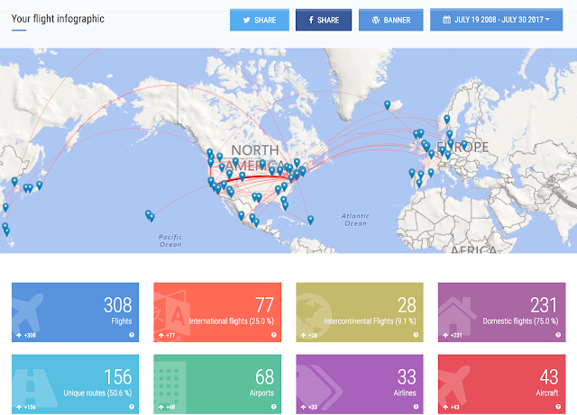
First off – who doesn't love a map! From there it shows a bunch of stats about my travel: the types of aircraft I flew, which airports I used, international/domestic breakdown, and maybe most importantly: Economy vs. Business vs. First 😂
On the disturbing news front: I've spent 58 days and 7 hours in the air! There's heaps more info to look at, so if you browse a snapshot of my data, go here.
When you're logged in there's are several other views beyond what you see in the snapshot. I really enjoyed seeing the breakdown of all the different plane types I'd flown on. The chronological view is also nice since it's much more smooth and scroll-able than the stuck-in-2004 interface that TripIt has.

They support several other types itinerary management software too.

First off – who doesn't love a map! From there it shows a bunch of stats about my travel: the types of aircraft I flew, which airports I used, international/domestic breakdown, and maybe most importantly: Economy vs. Business vs. First 😂
 |
| Rumors of my glamorous lifestyle have been greatly exaggerated… |
On the disturbing news front: I've spent 58 days and 7 hours in the air! There's heaps more info to look at, so if you browse a snapshot of my data, go here.
When you're logged in there's are several other views beyond what you see in the snapshot. I really enjoyed seeing the breakdown of all the different plane types I'd flown on. The chronological view is also nice since it's much more smooth and scroll-able than the stuck-in-2004 interface that TripIt has.


Comments
Post a Comment